Overview
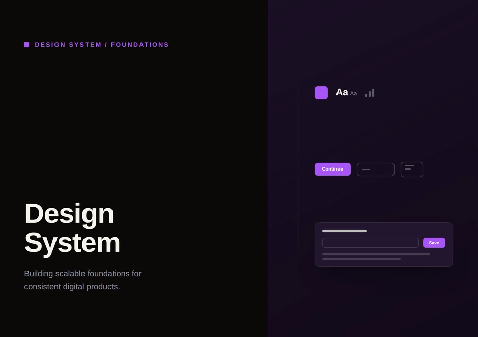
One token-driven design system taught component by component, and re-themed from Kayo's green to Binge's purple without the hierarchy drifting.
- Role
- UX Designer: tokens, components and patterns
- Brands
- Kayo (system 01) and Binge (system 02)
- Platforms
- Streaming: web, TV and mobile
- Nature of the work
- Semantic re-theming
- Design systems
- Design tokens
- Components
- Re-theming
How the system thinks
Don't explain a component. Teach it.
This is a guided walkthrough of one token-driven design system, taught component by component instead of documented. Every page answers the same questions a senior reviewer would ask: why the component exists, the problem it solves, how designers use it, how developers build it, and what changes between states. One idea per page.
Two versions of the system appear side by side throughout. Design system 01 is Kayo's, built around green. Design system 02 is Binge's, built around purple. The migration's job was to carry the whole system into the new brand without letting the visual language drift, so the story here is a semantic re-theme, not a redesign.
- #40F87FKayo brand green
- #A556FFBinge temporary brand purple
- #F9FAFANeutral: Binge primary button
- #DDDEDFNeutral: Binge primary hover
- #3D4549Neutral: avatar edit button
Tabs
Navigation that gained structure
Tabs organize related content into clear, equal destinations. The component focuses on navigation clarity: a stronger visual hierarchy, consistent active states, and a better separation between selected and inactive tabs. The goal is navigation that is easier to scan, understand and use.
Avatar
Selectable identity
These avatars are selectable profile pickers with checked and unchecked states, an edit affordance and an add action. The migration themed the selection ring and tick in Binge purple and moved the edit and add controls onto neutral greyscale tokens, keeping identity legible while the brand shifted.
Page headers
Orientation, two ways
Headers answer two questions: where am I, and what can I do here. The system ships two variants. A Default header serves everyday screens. A Color header is reserved for high-emotion flows, such as multi-profile, onboarding and acquisition, where a brand gradient sets the tone. The migration re-themed both while keeping their roles distinct.
Input field and toggle
Input field: the focused state, re-pointed
The active border is how a field says: you are here, type now. It is the single most important input state for orientation, and the migration re-themed exactly that.
Toggle: on means brand, off means neutral
A toggle applies a setting instantly. The migration made that meaning visible in color: the on state carries the brand, and the off or default state is a neutral transparency, so active always reads as branded across the system.
Slide dots and loaders
Slide dots: position, quietly
Slide indicators show position in a set. The active dot reads white in both brands, so the migration touched only the inactive track and kept the active marker as legible as possible.
Loaders: perceived performance, on brand
Loaders reduce uncertainty by giving immediate feedback during waiting states. The system defines consistent motion, sizing and color behavior, so loading feels responsive and reinforces one visual language across the interface.
Image fallback
Every empty frame, on purpose
The documentation ends on fallback frames across many aspect ratios: the placeholder shown when artwork is missing or still loading. Instead of a blank box, the system renders a branded DesignSystem placeholder sized to the exact ratio it replaces, so layouts never shift and nothing ever looks broken.
What changed, token by token
This is the migration written down: what moved from Kayo to Binge, component by component. Most of it is one semantic change: the brand color moves, and in some roles, such as the Primary button, neutral tokens replace the filled brand color.
| What changed for Binge | |
|---|---|
| Primary button | The filled Kayo green becomes a white background (#F9FAFA). Hover changes from a darker green to a grey fill (#DDDEDF). The disabled state stays grey, with a new neutral tone for Binge (#FFFFFF at 60% opacity). |
| Secondary button | All three states use a new neutral tone: default #FFFFFF at 20% opacity, hover or tap at 30%, disabled at 60%. |
| Tertiary button | No change. |
| Links | From the Kayo brand color (#40F87F) to Binge's temporary brand color (#A556FF). |
| Checkbox and radio | The checked state changes to Binge's temporary brand color (#A556FF). |
| Underline tab | The active underline changes to Binge's temporary brand color (#A556FF). |
| Square tab | Active: the border moves from Kayo green (#40F87F) to Binge purple (#A556FF), and the soft fill from #40F87F at 8% opacity to #A556FF at 15%. Default: a border is added (#FFFFFF at 20%) with no background fill. Hover: a soft tint fill is added (#FFFFFF at 30%). |
| Live label | The corner radius changes to radius-full (9999px). |
| Avatar, checked | The border moves to Binge purple (#A556FF). The fill and the tick fill both use Binge's soft brand surface color (#A556FF at 25% opacity). |
| Avatar, unchecked | The edit icon takes the greyscale text default (#F9FAFA). The edit button fill takes the greyscale surface (#3D4549). |
| Avatar, plus | The fill changes to Binge's greyscale transparency surface (#FFFFFF at 10% opacity). |
| Page header, default | Binge only. The border uses the greyscale transparency border (#FFFFFF at 20%). |
| Page header, color | Used in multi-profile, onboarding and acquisition flows. The border gradient moves from Kayo green (#40F87F) to Binge's temporary brand gradient (#A556FF). |
| Input field, active | The border moves from Kayo green (#40F87F) to Binge's temporary brand color (#A556FF). |
| Toggle, off | The fill uses Binge's greyscale transparency surface (#FFFFFF at 20% opacity). |
| Toggle, on | The fill changes to Binge's temporary brand color (#A556FF). |
| Slide dots | The dot background uses Binge's greyscale transparency surface (#FFFFFF at 20% opacity). |
What changed between the Kayo and Binge systems for each component and state.
What this walkthrough covers
This case study documents components, tokens and the re-theme. It does not include adoption figures, delivery timelines or measured results, and I have not added any.
Designed once. Scaled everywhere.