Overview
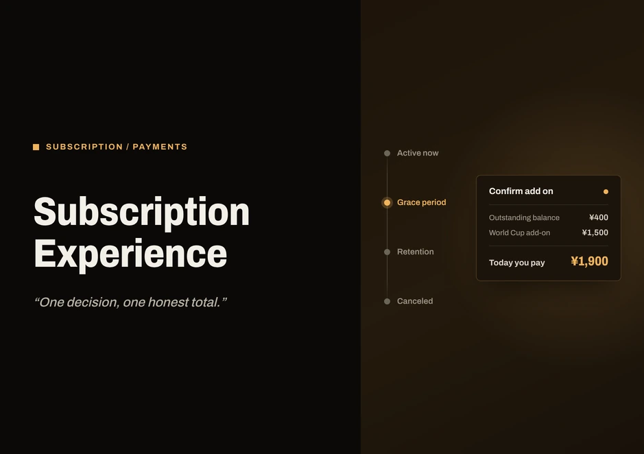
Most products cut you off when a card is declined. This one keeps the balance, rolls it into whatever you buy next, and asks for one honest total, not two separate battles.
- Role
- UX Designer, subscription and membership systems
- Company
- DAZN
- Platforms
- Web, iOS, Android and TV
- Context
- FIFA World Cup 2026, a multi-release program
- Subscriptions
- Payments
- Heuristic evaluation
- Design systems
The brief
I worked with the Product and Payments Engineering teams across web, iOS, Android and TV, on a multi-release program rather than a single sprint.
DAZN does not have one subscription product. It offers six, including Premium, Motor, Futbol and Baloncesto, each built around a different sport. For the 2026 FIFA World Cup, tournament access had to be folded into all of them at once, not sold as a separate product on the side.
My job was everything under that decision: helping someone understand what their plan actually covers, comparing it honestly with the alternatives, and making sure they bought the right thing without needing a spreadsheet.
Buying decisions for a World Cup are made in the days leading up to kickoff. Under that pressure, every screen in the system has to resolve one signal correctly, paid or already included, across all account states at the same time.
How the market compares
The rest of this market is simple. DAZN is not, by design.
I looked at how competing subscription services handle live sports. The data came from public sources, not from my own design files, and I wanted to avoid confusing market practice with my testing of the product DAZN shipped.
ESPN has one direct-to-consumer tier for sports. For Netflix and Prime Video there is no comparison screen to design, because they treat live events as a feature of a larger entertainment subscription, so sport just shows up in the feed. Apple TV+ keeps its basic subscription model but sells premium sports, such as MLS Season Pass, as a standalone product. Fubo and Roku bundle by channel package, not by individual sport. JioHotstar is the closest to DAZN's shape, with multiple tiers reaching different audiences, but it leads with price rather than entitlement.
DAZN is the exception, with sport-specific tiers rather than one universal plan. That is more flexible for the business and significantly harder for a subscriber to parse in the ten seconds they will actually spend looking at a pricing page.
| DAZN | ESPN | Netflix | Prime Video | JioHotstar | Apple TV+ | |
|---|---|---|---|---|---|---|
| Business model | Sport-only, subscription-first | Sports first for streaming | Entertainment first | Ecosystem subscription | Sport and entertainment | Entertainment first |
| Content strategy | Rights for specific sports | Top-tier sports rights | Choose live events | Special sports events | Sports and entertainment by region | League-exclusive partnerships |
| Subscription shape | Multi-level planning | Basic tiered plans | Solo subscription | Comes with Prime | Multi-level plans | Single subscription, sports if you want |
| Monetization | Subscription and pay-per-view | Subscribe | Membership | Prime membership | Subscription | Subscription and add-ons |
| What it costs the UX | Expensive to compare | Easy purchase flow | No comparison of plans | Map of the ecosystem | Cost-effective choices | Separate entertainment and sport purchase |
Comparison of DAZN with ESPN, Netflix, Prime Video, JioHotstar and Apple TV+ by business model, content strategy, subscription shape, monetization and what each costs the user experience.
None of that gave me any sense that DAZN's business model needed to be forced into a more straightforward model. It told me the complexity people run into is not really a pricing problem, it is an entitlement problem. Everyone knows the price of things. They have no idea what they have.
So the opening was not about cutting down on tiers. It was about making sure coverage, benefits and eligibility are clear before someone swipes a card, not after.
A heuristic audit, not research
For this workstream I did not work through interviews or analytics. I went straight into DAZN's live product, on web and mobile, and did a heuristic evaluation, flow analysis and interface pattern review. Four things kept happening.
The same subscription sounds different from one place to another
Screen to screen and device to device, entitlement is described in slightly different language, so it is genuinely difficult to know exactly what you would be getting before you buy.
Integrate entitlement messaging across touchpoints.
Comparing plans is hard work
You are knee-deep in a handful of cards, feature lists and price points before you even know which subscription lines up with how you really watch.
Surface the real differences up front and hide the rest through progressive disclosure.
The levels are all set at roughly the same pitch
Messaging in the lower tier and the higher tier is almost identical, but they serve people with different motivations and different viewing habits.
Customize the message to the individual values of subscribers in each tier.
Paying and watching are two different things
The disconnect causes friction right after you have paid. Buying a subscription does not mean you know how or where to actually watch.
Keep entitlement and activation separate, and give clear guidance once the purchase is finished.
These four findings turned into a short list of rules that I applied to every flow afterwards:
- Be explicit about what is included before you talk about the price.
- Reduce friction, not choice. A complex model can still feel simple with better guidance, without quietly taking away options.
- Do not use the same script for everyone. Tailor the message to what people really care about at their level.
- Do not put someone in the middle of a decision and force a context switch.
One account, three things
Three things on one screen that used to blur together
In the interface, three things kept visually colliding under one account: what plan you are on, what you have paid for, and what you can actually watch. Separating them conceptually, even on a screen that shows all three at once, is what let five very different flows share one visual language instead of five.
Subscription
Active plan, subscription level, upgrades and entitlements.
Billing and payments
Billing status, payment methods, grace period, renewals and transactions.
Access to content
League passes, FIFA World Cup pay-per-view events, purchased add-ons and viewing rights.
A subscriber is not only one thing
An account moves through states: Guest, Active now, Grace period, Retention and Canceled. A failed payment moves someone to the grace period, not to Canceled. When people try to leave the Active state, they are redirected to a “Stay with DAZN” screen before being switched to Canceled. That stop is intentional, not a formality.
Five journeys that go all the way across the system
Buy a subscription
Find, view plans, choose plan, checkout, subscription active.
Plan management
Current plan, compare plans, upgrade or downgrade, confirm updated subscription.
Recovery of payments
Payment failed, grace period, change payment method, payment method confirmed, subscription restored.
Keeping subscribers
Cancel subscription, retention offer, keep subscription.
Unlock premium content
Check entitlement, activate access, partner platform, ready to watch.
One checkout, two journeys
Checkout could not be one screen for everyone
The HBO Max bundle needed a third journey. New and existing subscribers needed truly different paths, so I looked at both and worked out how they could share a spine.
It is the same underlying checkout, customized to whatever account state someone is actually in. New subscribers get the entire journey, while existing subscribers get contextual guidance based on what they already have, with fewer steps and a clearer decision.
Five decisions
There were five moments where the logic behind the decision mattered most.
1. Tiered purchase: the World Cup offer needed an upsell on every tier, not just the top one
Before this went out the door, the same World Cup offer had three different reads depending on which device you met it on. The fix was not really visual. It was ordering: lead with the state of the entitlement, use Premium to anchor the decision, but do not hide the cheaper, sport-specific tiers right next to it.
The Standard and Youth toggle changes the price, not the journey. Premium carries one ribbon as the main path to the tournament. Motor, Futbol and Baloncesto all show the same red add-on card, the same component with the same copy pattern, so every subscriber sees the offer in the same format, whichever sport brought them there.
2. Executing the plan: upgrading should not feel like starting over
There was no real way for existing subscribers to move up a tier without feeling like they were cancelling one subscription and buying another. The fix was to stay inside the existing account: current plan, upgrade, review, done.
The pricing is intentionally unambiguous. “Today you pay ¥1,980” sits right next to the future recurring number, so no one has to guess which number applies when. The upsell banner on the account overview does not disappear once you have upgraded. It converts into an Active badge in the same slot: same place on the screen, different state. The journey begins and ends in the same account context.
The outcome here is directional: a predictable, uninterrupted upgrade, not a measured result.
3. The flagship payment recovery: do not block, roll the debt into the new purchase
One decision, one honest total.
The old logic treated a failed payment as a wall: no new purchases until the balance clears. From an accounting perspective that is clean. From a product perspective it does not work, because it prevents a sale to a customer who is trying to make a purchase.
The message reads, “Your account will not be suspended, and we will try again in the next few days.” The tone is calm throughout. I do not have a measured result to point to here. What I can say exactly is what it was built for: removing the hard block should recover sales that a stricter checkout loses outright during a window of payment failure.
4. Retention: different tiers should not share the same cancellation screen
People leave with different things at stake. Someone who already has the FIFA World Cup pass included has a very different set of stakes from a subscriber on the lowest tier.
The lower tier gets the fear of missing out: pay a little more and do not miss the tournament. The higher tier gets loss aversion: you already have the subscription, do not waste it. It is the same screen and the same button, with different stakes made visible.
Directionally, matching the message to what is actually at risk should convert more of the grace window into recovered subscriptions. I do not have a number for that yet.
5. One account, a second vertical: buying the bundle and being able to watch it are two different moments
When you buy DAZN plus HBO Max, you do not get immediate access to HBO Max. There are three states in the middle, each with its own screen: not included, included but not yet activated, and already active.
The screen right after checkout is a basic confirmation that payment was processed. It does not deal with HBO Max yet. Activation stays an intentional action rather than something quietly added to checkout, because adding it to checkout would have meant making an assumption, on someone's behalf, about an account they have not set up.
One state machine
All the screens work on the same principles, the same state machine and the same handful of colors
One state machine is reused for every transaction. The same three-state button appears almost unchanged in Upgrade, Paused, Soft cancel, Active grace and the Spain checkout, which are five separate files. That consistency is the interaction spec: Confirm (idle), then Processing (loading), then Success (resolved), then the overview, updated (back to context).
There are no empty and error states in my files, because every flow has only a success path. That is a named gap, not an oversight. Mobile checkout is a single column and sequential throughout. The only place that breaks the pattern is the desktop acquisition file, which has a real two-column layout with a form on the left and a live purchase summary on the right. Retention and resume prompts are centered overlays on a dimmed background, never full-screen takeovers.
States are assigned color, not features. The system does not use a different color for every feature. It attaches meaning to product states and uses the same few colors for subscriptions, payments, recovery, retention and entitlement management.
- #0A0A0AInk
- #F3F2EDPaper
- #F5E400Paid
- #4FD2A0Included
- #FF6B6BUrgent
- #FFB200Soon
What I can and cannot back up
The accessibility status indicators use color and text labels (for example Active, Payment failed and Paused), so they can be understood by people who cannot rely on color alone. Tap targets on mobile are also generously sized throughout.
What I cannot tell you from static exports is the contrast ratios, the screen reader labels, or the keyboard and focus order. There is no annotation layer in my files for any of that. I am pointing this out as a gap, rather than making an assumption either way.
Each screen in this system solved a different problem. The experience as a whole solved one: the interaction model was kept familiar, predictable and reusable on purpose, across every journey. I did not create a new pattern for every feature. I relied on one shared design language, which is what actually reduced the cognitive effort and built confidence through the subscription lifecycle. It is also what turned a set of isolated flows into something that acts like a single product.
Every subscribing state. One coherent system underneath.