Overview
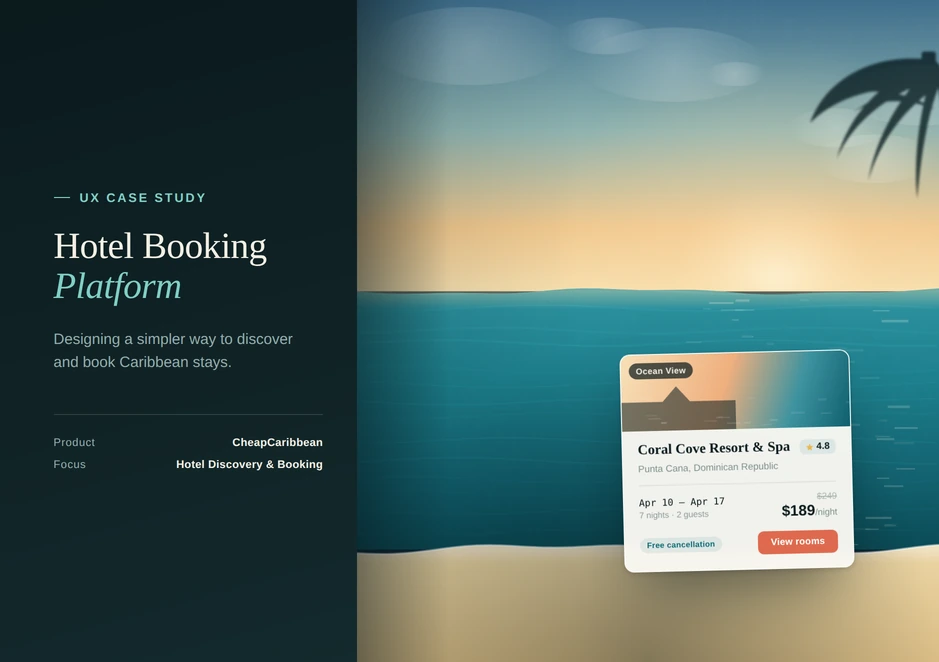
A simpler way to discover and book Caribbean stays: three ways to start shopping, then filters, a price calendar, a price map and a hotel page that keeps the fine print one click away.
- Role
- UX Designer, Motivity Labs
- Client
- CheapCaribbean
- Platform
- Web
- Focus
- Hotel discovery and booking
- Web
- Travel
- Search and filters
- Booking flow
Mockups
These are the final screens for CheapCaribbean's hotel booking experience on the web, from the first choice a visitor makes through to the policies for a single property.
How would you like to shop?
Home page
Browse everything
Shop by calendar
The calendar view shows a starting price per person for flight and hotel on every date, across three months, so a traveller can choose when to go by price.
Shop on the map
Hotel details
Policies and advisories
Two buttons at the foot of the hotel page open the property's policies and advisories as modals.
Style guide
- #25CAD0
- #DB487E
- #09153D
- #666C7A
The typeface is Roboto, in four weights: regular, medium, semibold and bold. The project notes give the reason for choosing a typeface at all: type shapes both readability and the overall experience, sets a clear hierarchy, improves legibility and adds character, so information is easier to take in.
UX case study
The brief
CheapCaribbean sells flight and hotel packages to Caribbean destinations. The project was to design a simpler way to discover and book those stays on the web. I worked on it as a UX Designer at Motivity Labs.
Process and timeline
The work followed a four-week plan, one phase per week.
Week 1: Research
The idea, the target audience and the market.
Week 2: Moodboard
Inspiration, curation and presentation.
Week 3: Wireframe
Sketching the layout of the user interface.
Week 4: UI design
Conceptualisation, refinement and iteration.
What the design does
Lets visitors choose how to start
The landing screen opens with the question How would you like to shop? and three answers: take a trip survey, browse everything, or explore the map.
Puts the lowest price first
The home page headline states the lowest package price, Air plus Hotel Package Deals From $396 Per Person, before the search and the results.
Offers three ways to look at the same deals
Browse Everything is a filtered list, Shop by Calendar compares per-person prices across dates, and Shop Map shows deals by place. The three views sit in one navigation bar.
Narrows results with filters
Price range with a histogram, hotel class, hotel brand, themes, trip duration and stops, plus quick chips such as All-Inclusive, Adults Only, Family Friends, Luxury and Spa.
Keeps the booking panel with the property
On the hotel page the photos, property information and description sit beside a booking panel with the price, dates and a Select Room button.
Puts the fine print one click away
General policies and hotel advisories open as modals from two buttons on the hotel page.